
- Application
- Branding System
- UX/UI Design
Mark Lauren is an international bestselling fitness author whose exercise journey has inspired millions to move beyond the confines of a gym. Together, we birthed a subscription platform made of customizable body-weight workouts.
Challenge
As a content creator for the better part of a decade, Mark came to us with an extensive catalog of disparate product verticals — books, DVDS, mini-courses, PDF downloads, an outdated mobile app and more. With a desire to future-proof his content, reinvent his brand identity, and build scalability into his creation process, we led the conversation toward going fully digital.
Problems To Solve
Past customers required convincing to purchase a new service
Disparate brand identities spanning many books, DVDs, and web content
Existing IP was single purchase, with little opportunity for recurring revenue
Platform required calculated prioritization of features to encompass goals within the client’s budget
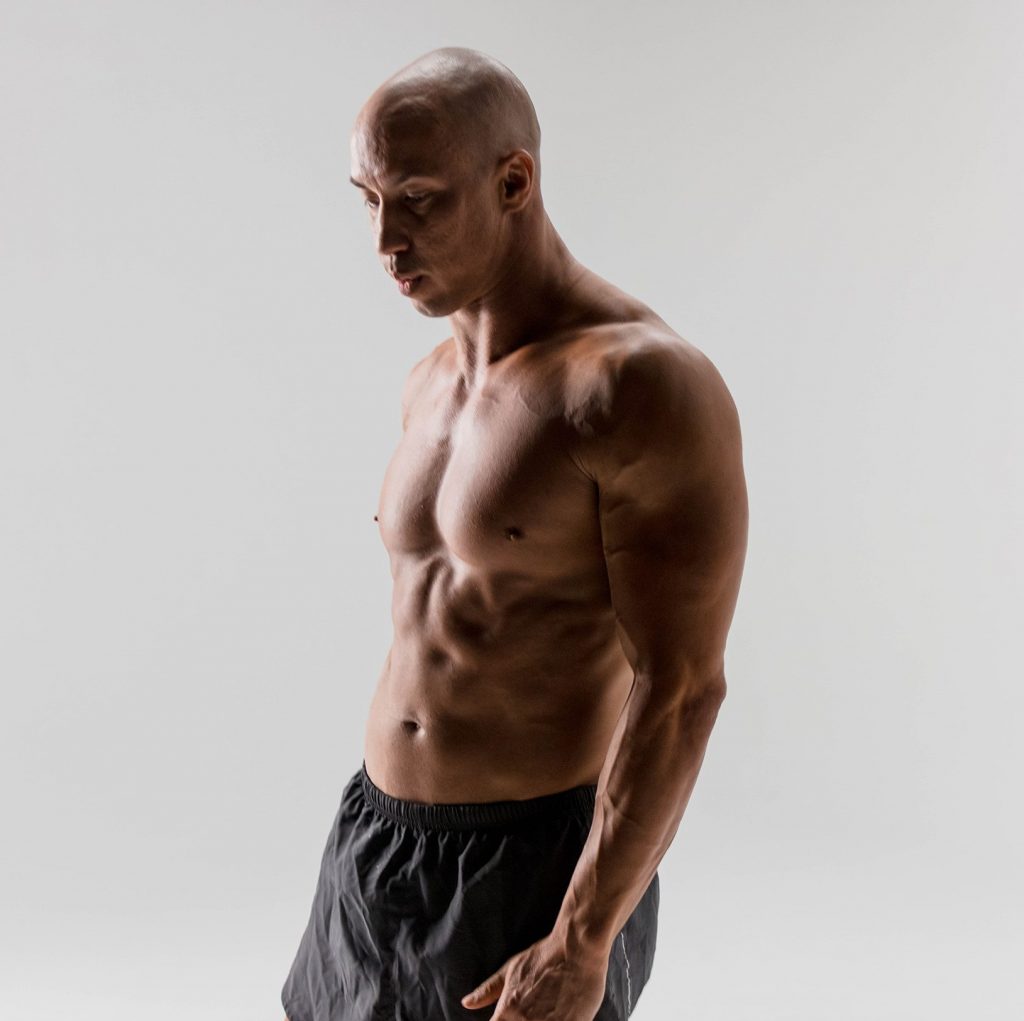
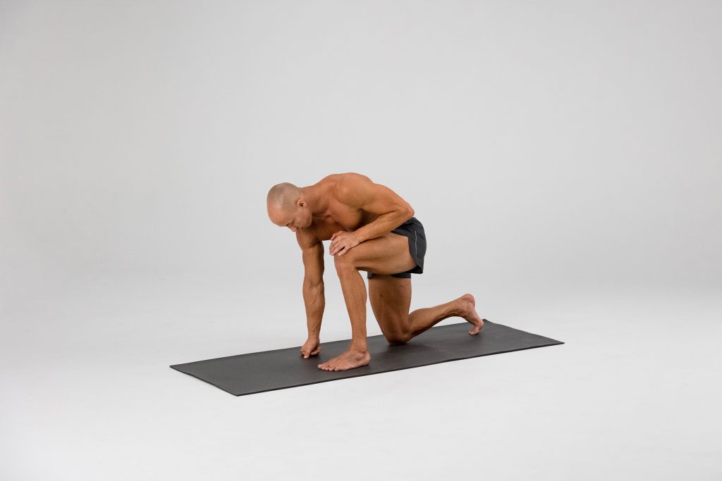

Customized. Fitness. Anywhere.
Approach
After dreaming up various concepts of what this new all-in-one fitness platform could be, we determined that the most sustainable business model would be to build a streaming video platform where tailored workouts would be delivered through a monthly subscription.
Brand Identity
As a fitness brand, but more so as a person, Mark Lauren represents a lifetime of dedication to one basic form of human survival: movement. This concept transcends the physical aspects of exercise — it speaks to our trajectory as achievement-oriented beings and transports us to our future.
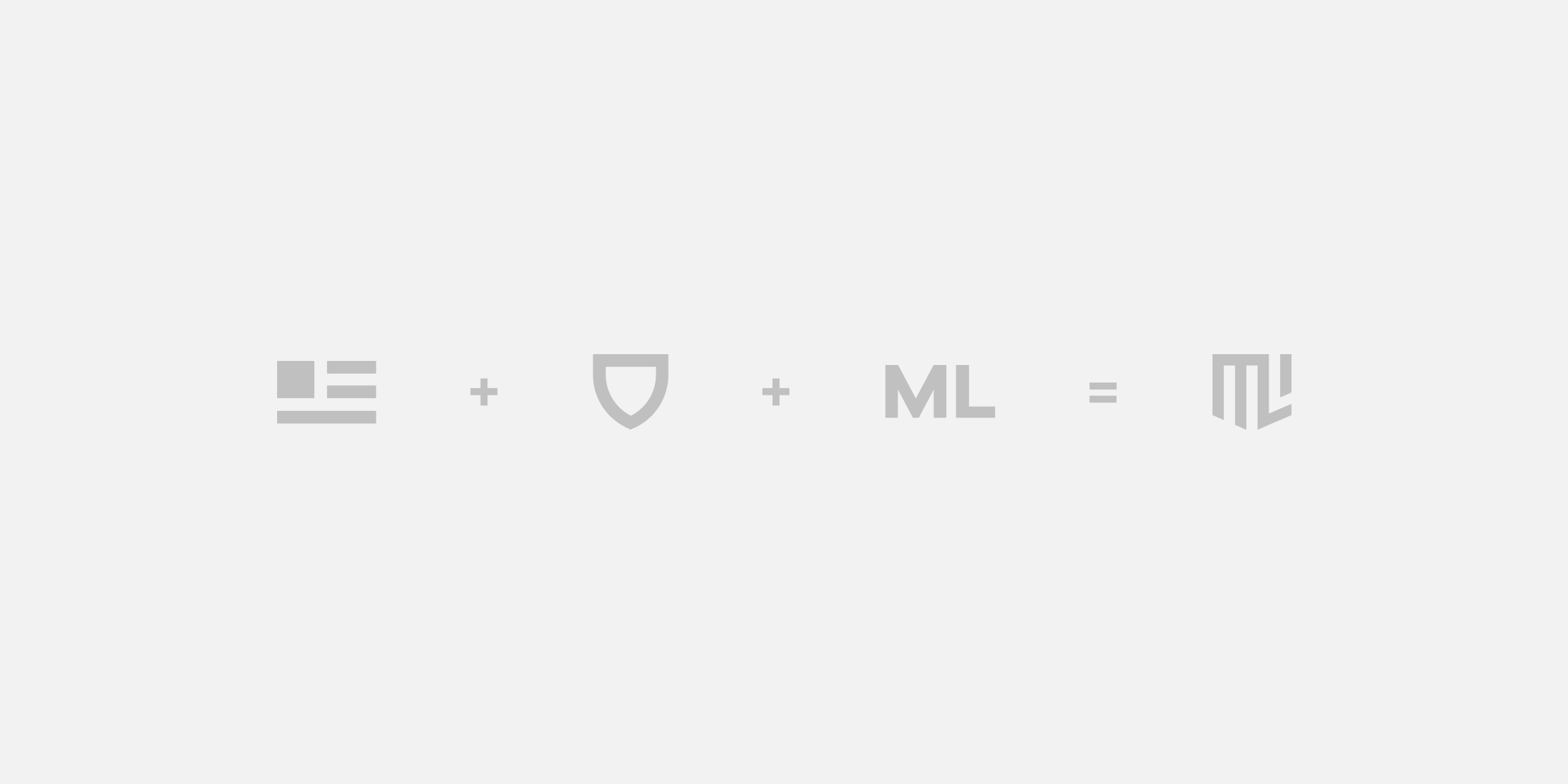
With this concept as our inspiration, our identity direction translated Mark’s philosophy of physical movement into digital motion design. In parallel, we sought to capture his military background and focus on simplicity in the primary logomark — earned stripes, a badge of honor, timeless and steadfast.



UX Strategy
Research
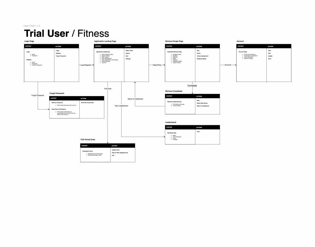
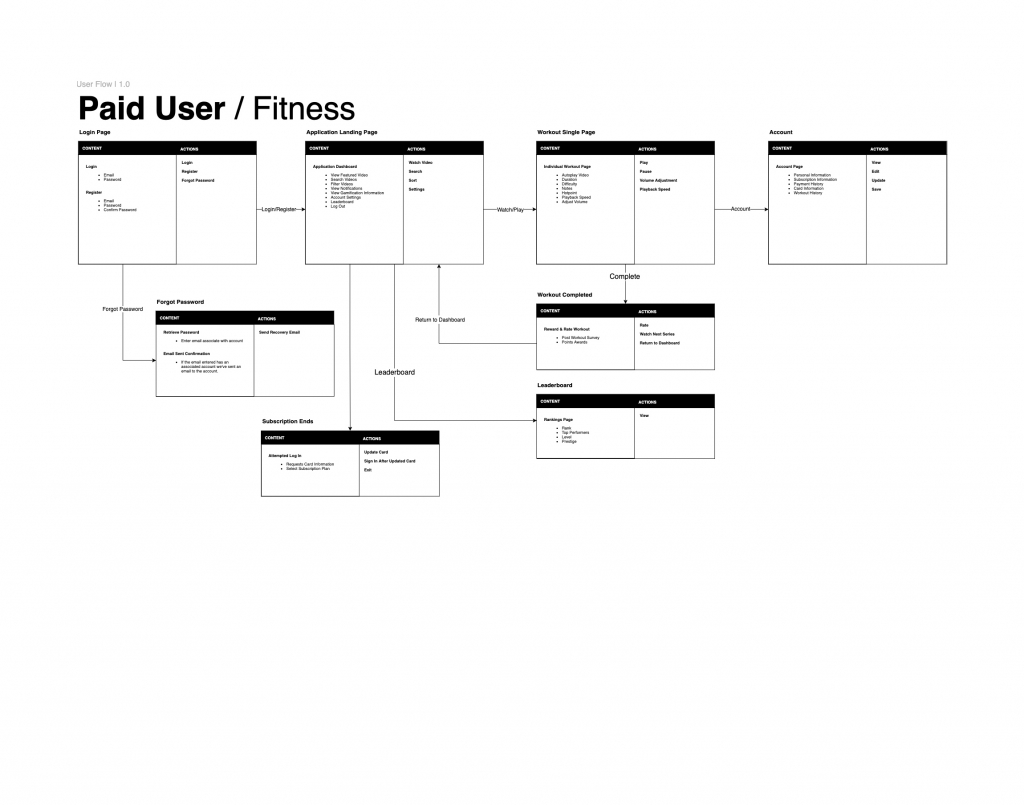
Starting with user types, we outlined strategic goals for Mark’s potential customers to achieve by navigating through a conceptual UX flow. Through deeper discovery, research, and strategy, we defined the application’s initial epic, core feature set, and backlog items to begin building our product roadmap.
Scale
We approached Mark’s application with the understanding that it needed to work across all major browsers and devices, in a myriad of bandwidth limiting situations, and behind large government firewalls such as China’s.
Experience
We created the app as a “Progressive web app”, not unlike Gmail, Alibaba, or West Elm. Advantages of this are inherit HTTPS, offline mode (aside from streamed content), web push notifications, and “Add to Home Screen” prompts on most major devices allowing for a semi-native app experience on mobile.

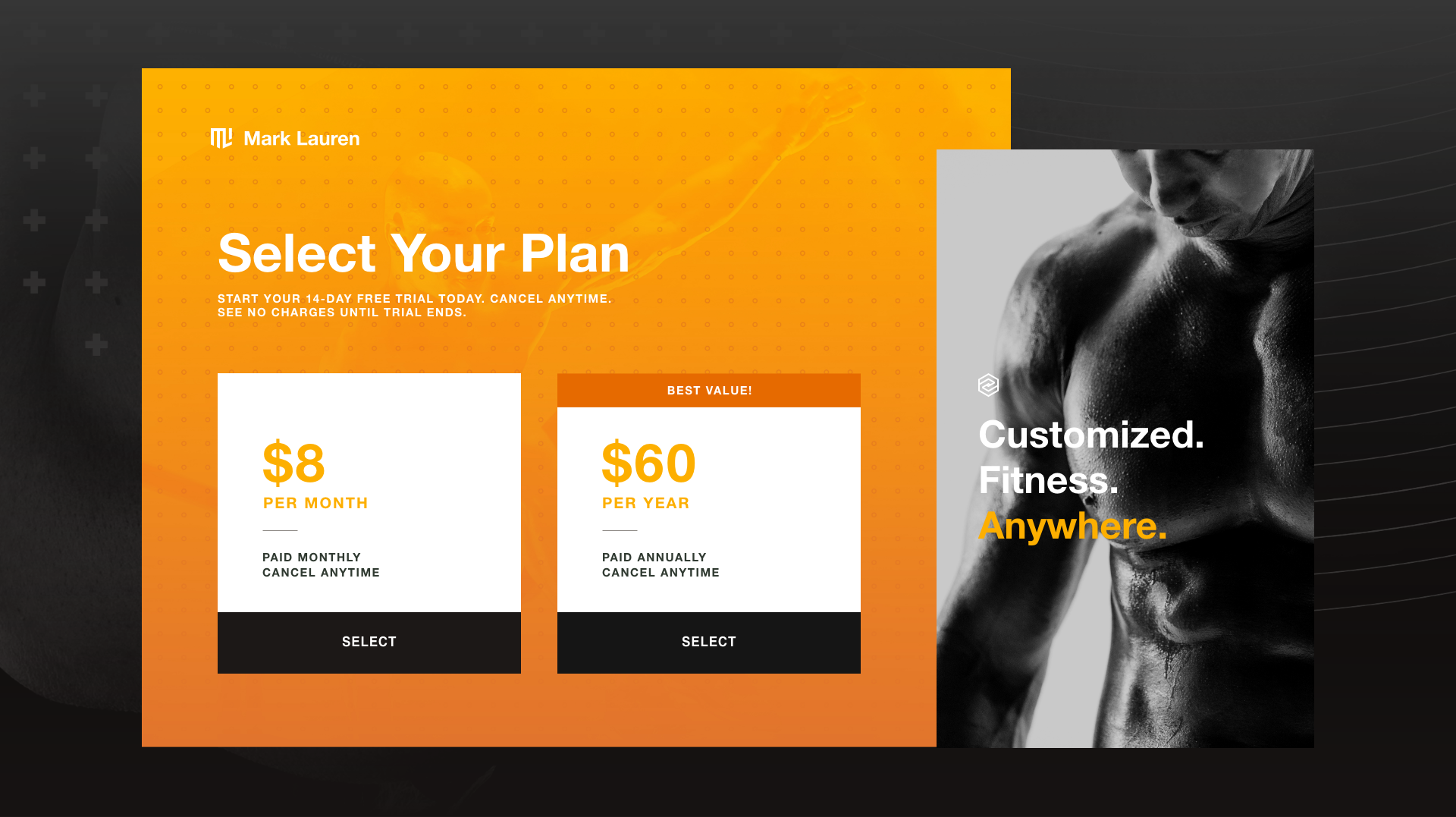
Simple, affordable monthly or annual subscription plans
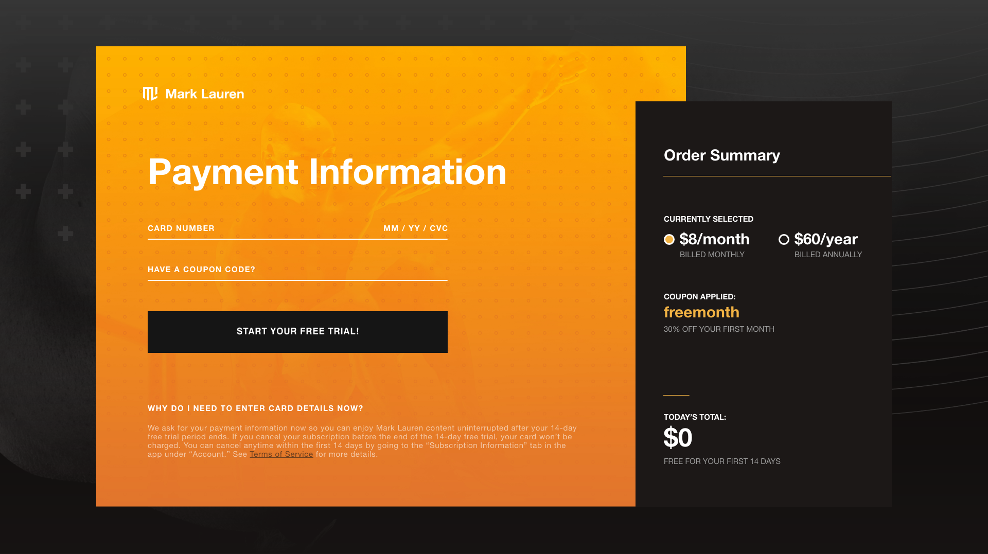
Contextual checkout upon signup
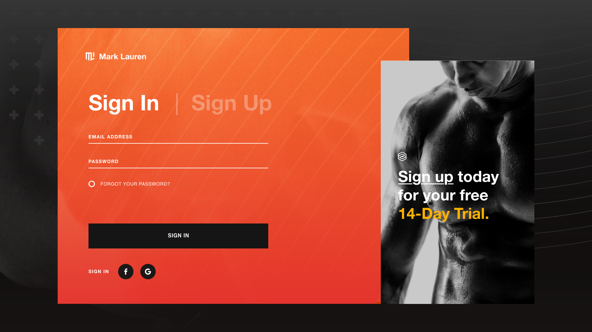
Sign in with email, Facebook, or Google
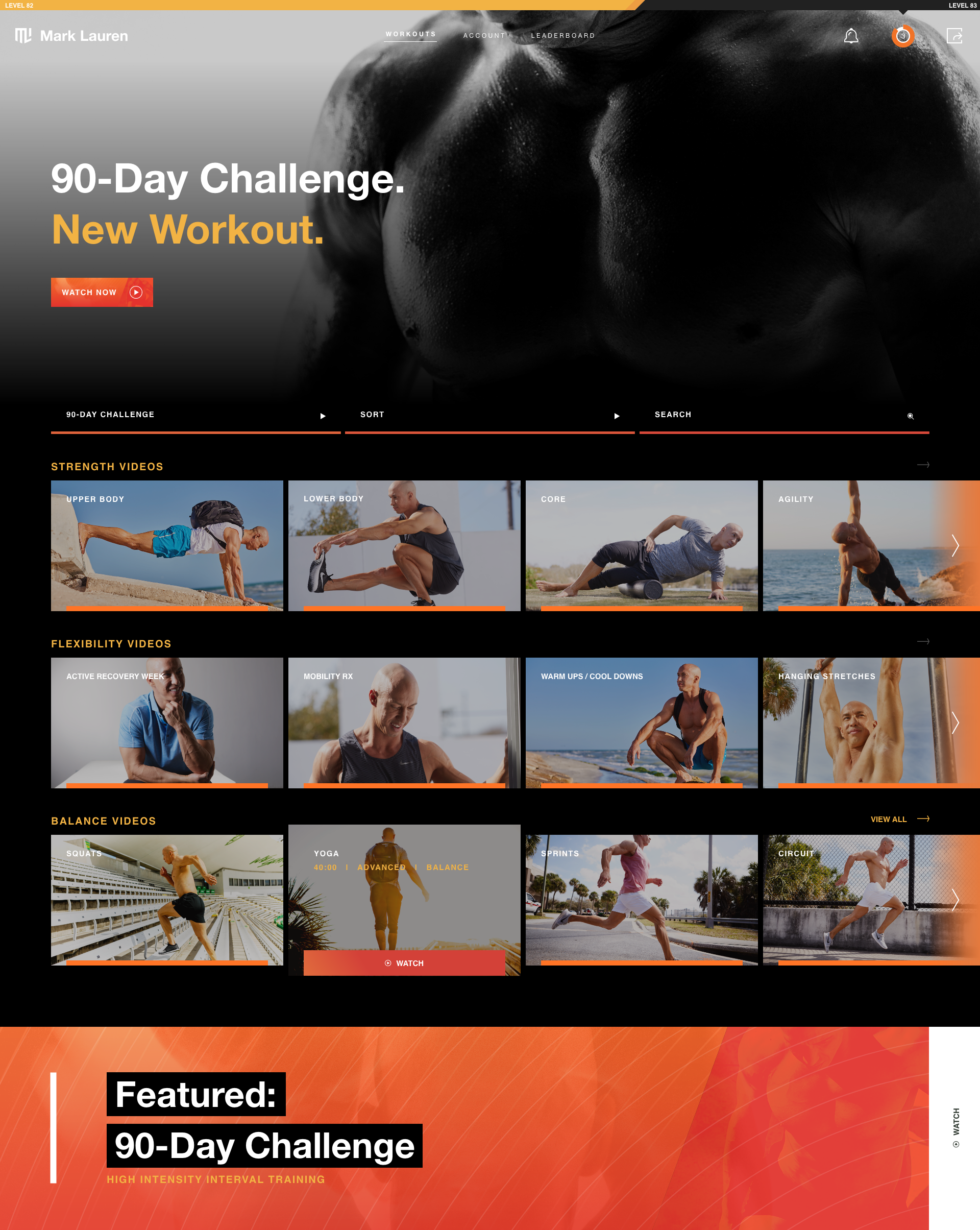
Intuitive dashboard of searchable fitness content, organized by category
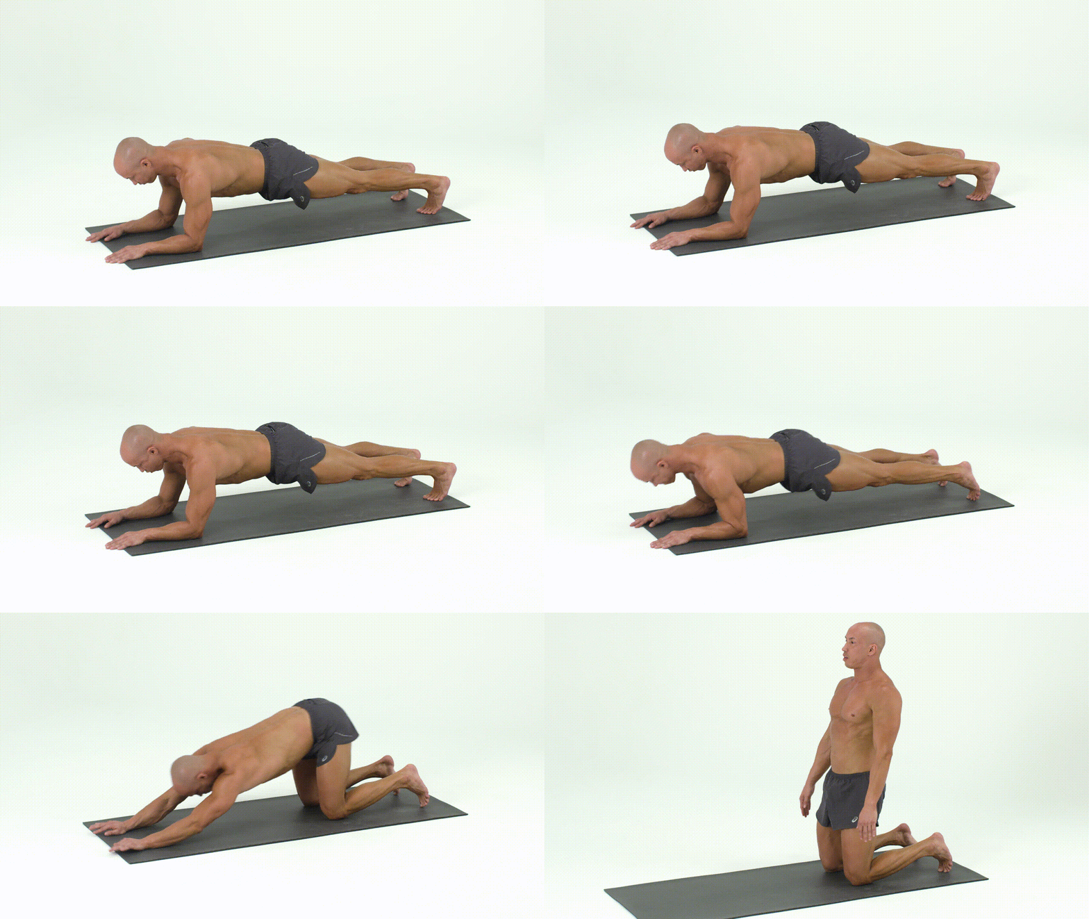
Bodyweight workout sample
Build
We used ReactJS as our primary Javascript framework, an efficient vehicle in serving data. Instead of clicking a button and loading another page, only the data that needs to change on the page gets updated, saving time, bandwidth, and power.
Management
The CMS needed to be simple and flexible enough that Mark’s team could easily update, administrate, and add content. We found this NodeJS CMS, Keystone — the primary administration panel for the site. We integrated Stripe subscriptions for billing, and JWPlayer for hosting and serving video content.
Communication
One of the key aspects of the app heading has been direct communication with the users. Rather than relying strictly on A/B testing or usage analytics, we leveraged Intercom to aggregate bug reports, gauge mood, and prioritize feature development.
Design System
We outlined the various types of users that would interact with the application in order to measure whether the UX/UI design met core goals and business objectives. After establishing a cohesive design language, we set out to deliver an empathetic experience through utility and real-time information.
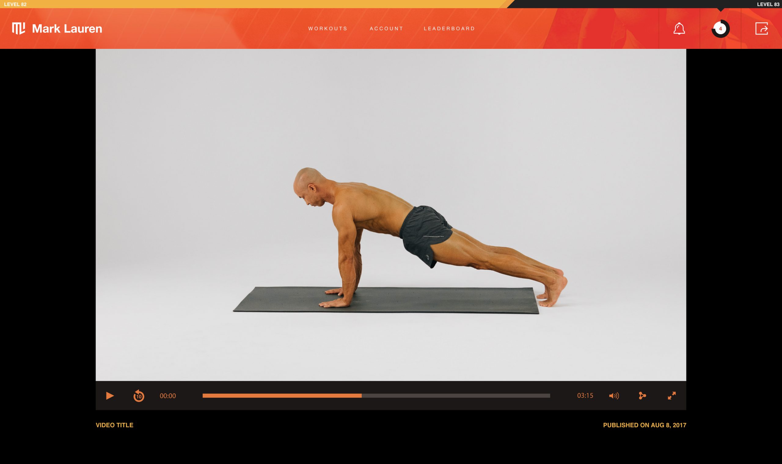
Intuitive custom video player built on JWPlayer for flexibility and scale
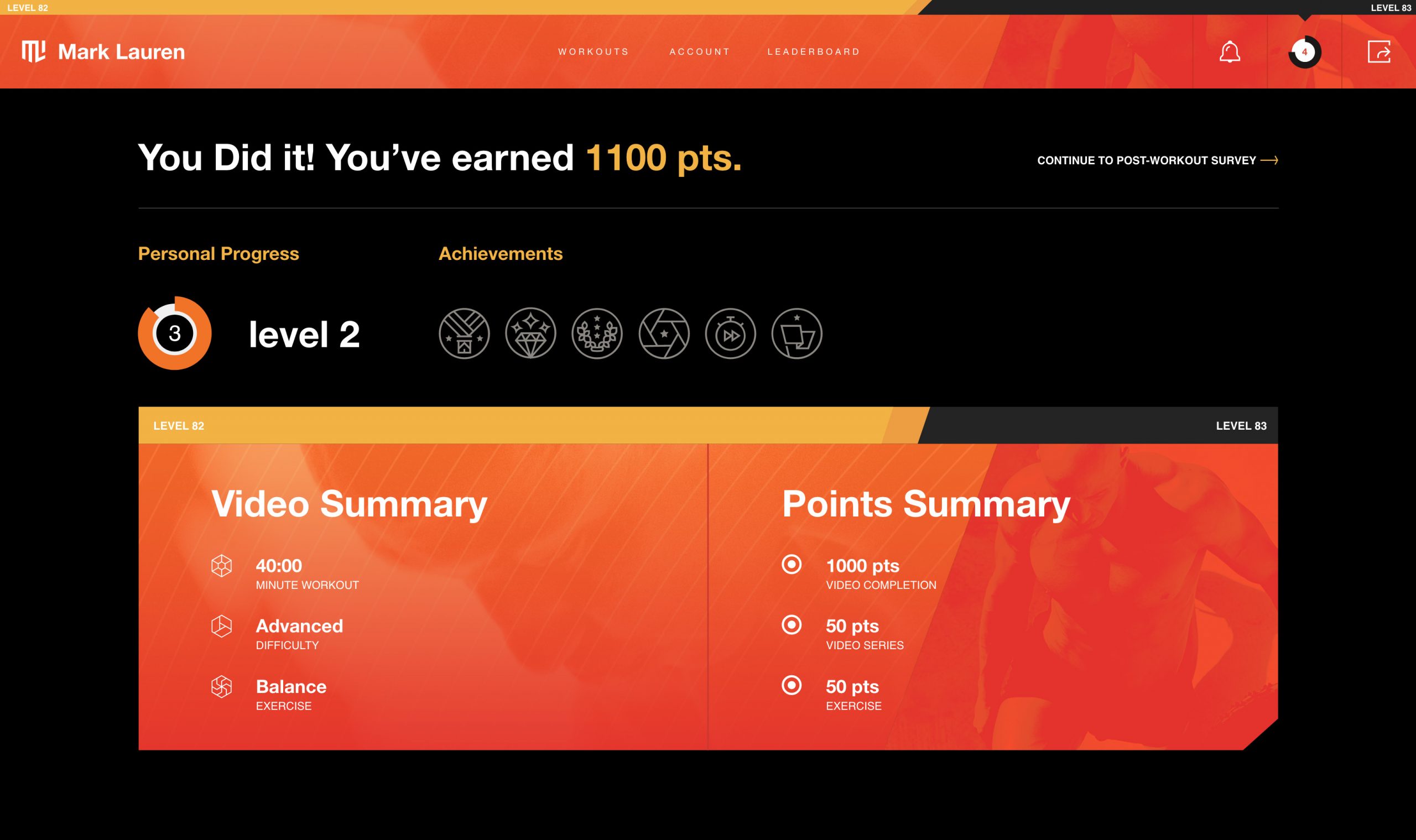
Gamification: users earn points each workout, contributing to a leaderboard
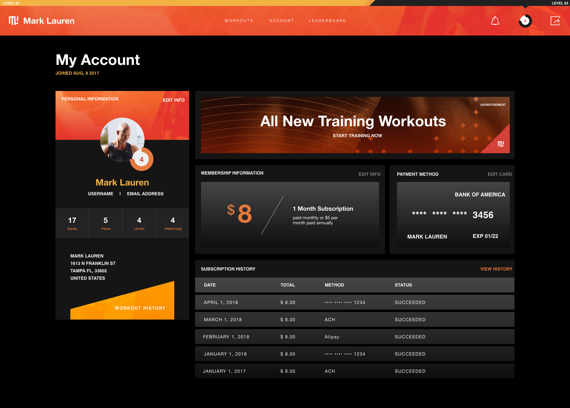
Modular, useful account management across all device sizes
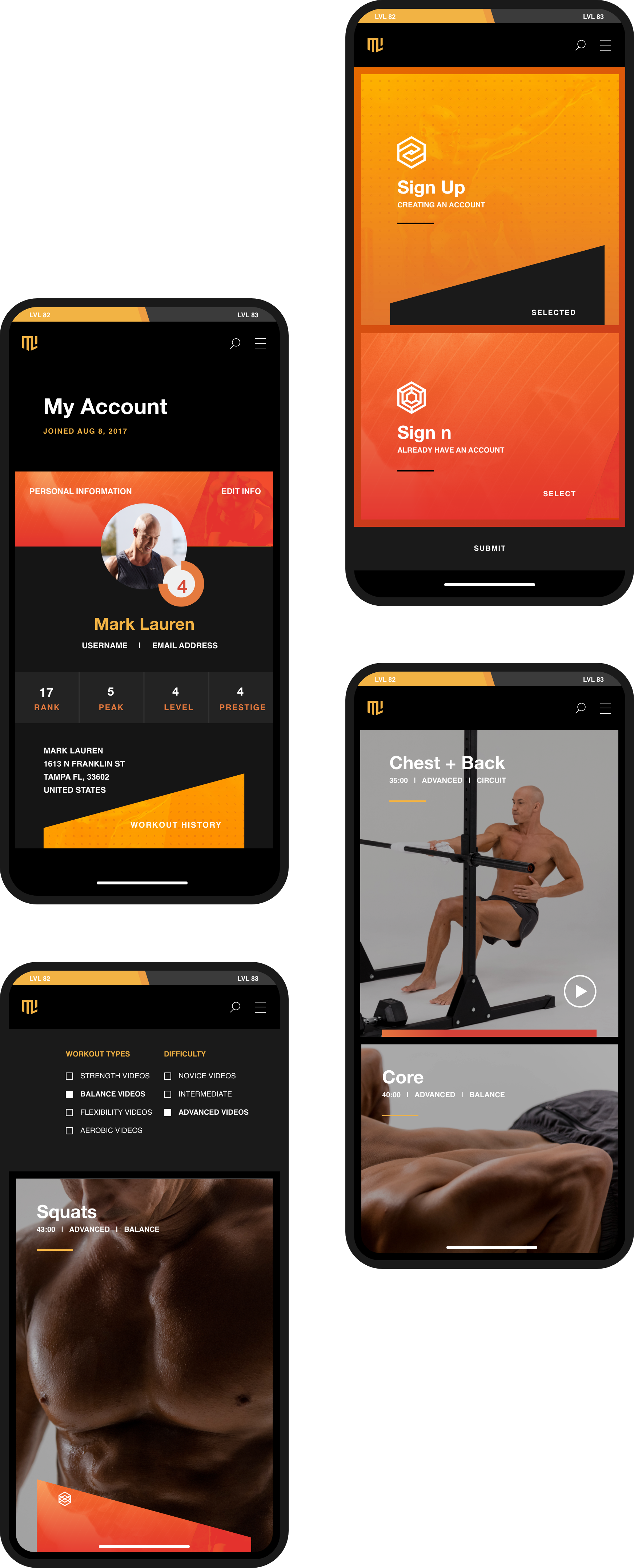
Standardized design across Android and iOS helped create a cross-platform, device-agnostic workout from anywhere in the world.
Now, we have a new brand story that unifies us with one human, evidence-based, clear, optimistic, and bold voice. It universally describes who we are, what we believe, how we think and operate, and, of course, what we do.
Mark Lauren
Founder
Results
Built a dynamic, subscription fitness app with recurring revenue streams
Added a gamification system to incentivize completion of fitness goals
Created a full brand identity system including guidelines and motion graphics
Recouped investment and achieved profitability in under a year after launch
Next Project
Application — Get In The Game